
Weekly Problems
Psychology 2300 - Introduction to Statistics
Instructor - Dr Jeremy Jackson
Week 2
Consider an organization with two managers they wish to evaluate. The organization would like to know what the employees that work for the manager think about the manager's leadership abilities. The organization decides to assess this complex, subjective disposition with a simplistic, objective quantitative survey. They ask the employees of each manager, on a scale of 1-10, "Please rate how good a leader your manager is, with 10 being exceptional and 1 being very poor." Manager "A" (Mr Machiavelli) and manager "B" (Mrs Macbeth) receive the following ratings:
Mr Machiavelli: 2, 9, 5, 3, 7, 4, 10, 8, 3, 4
Mrs Macbeth: 4, 6, 5, 4, 5, 4, 6, 3, 4, 4
Your job, as a senior consultant in the division of institutional research at the international consulting company "Walnut", is to advise the company about the leadership abilities of each of their two managers. Since you have forgotten most of what you learned in your first statistics class, you send an email to your old statistics instructor asking him for help. He advises you to:
i) Calculate "n" for each manager.
ii) Calculate ΣX for each manager.
iii) Calculate the deviation score for each employee of each manager.
iv) For each manager, calculate Σ(x-x̄)
Unfortunately, as your statistics instructor is getting old, he forgot to tell you what to do with the results. So that's your job.....
v) What do the results you calculated in i-iv tell you about the leadership abilities of each manager?
Week 3
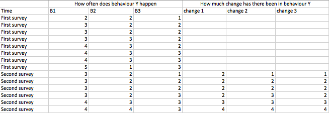
WARNING...the following is real data from a real consulting assignment! Names have been changed to protect the anonymity of the innocent. Some time ago, I was asked by a human resources consulting company to provide input on the content and analysis of a management development survey. The client, "Coconut" asked me to put together a short survey which they would use to assess whether or not managers were reducing the frequency of 3 specific behaviors their direct reports found undesirable. The survey was administered twice to the direct reports of each manager - the first survey was administered in April and the second was administered in July. The objective was to assess whether or not the frequency of the 3 behaviors had gone down between April and July. For each of the three behaviors, direct reports were asked : 1) Rate the extent to which your manager currently engages in this behavior (5 was "often" and 1 was "never") and 2) How much has this behavior changed since we asked you about it in April (5 was much more frequent, 3 was no change and 1 was much less frequent. So, for each manager, 3 questions were asked in April (how often does your manager do behaviors 1, 2 and 3) and 6 questions were asked in July (how often does your manager do behaviors 1, 2 and 3 and how much have behaviors 1, 2 and 3 changed since April). The following is data for one of the managers, we'll call her "Celestina":
Now, the HR consultants at Coconut have very little experience with data analysis and reporting so they ask you (they asked me) what should we do with the data to help communicate to Celestina what her direct reports think about the frequency with which she is engaging in the 3 behaviors. I advised the Coconuts to do the following:
i) Calculate "n" for each survey.
ii) Calculate ΣX/n for the frequency of each behavior on survey 1 and survey 2 separately for each of the 3 behaviors (so that would be 6 means).
iii) Calculate ΣX/n for the amount of change in each behavior for each of the 3 behaviors (so that would be 3 means).
iv) Generate a line graph of the 6 means calculated in "ii" above with time (April and July on the horizontal axis and mean score on the vertical axis). There should be three lines on this graph....one for each of the 3 behaviors.
Based on this data, how would you advise Celestina about whether or not she is reducing the 3 problematic behaviours....Imagine you are the consultant and Celestina is meeting with you....Imagine how that is...Celestina is anxious, she is doing things here direct reports don't like....she is concerned about whether or not she is getting better....so when considering your advice, think about the reality of the situation a bit. These are not just numbers.....they reflect the opinions of real people about someone that is concerned about their behaviour....they are potentially hurtful.
NOTE: There is a real conundrum in these data. A serious problem that I discussed with the consultant at Coconut before we even administered the survey. I warned Coconut that this might happen (but they went ahead anyway)....and it did happen! Can you see it?
Week 4
Is the globe getting warmer? Some people say yes, some people say no. Some people say it's not that its getting warmer, it's that weather is getting more extreme. What does that mean? Well, perhaps just that the weather is getting more variable. That the weather changes from one year to the next or one moment to the next more than it used to. The linked file HERE, is yearly NASA global temperature data for the years between 1980 and 2016. I have separated these years in to two periods - before and after (1980 to 1998=before and 1999 to 2016=after) or you could say past and current. Each row in the data file represents data averaged over an entire year and each column represents a particular area of the globe. The numbers in the cells represent the number of Celsius a particular year in a particular area of the globe was above or below an arbitrarily chosen constant. So let's say the constant is 12 Celsius, then the value of .09 for the whole globe in 1980 would mean that the average temperature for the entire globe in 1980 was 12+.09=12.09 Celsius. So positive values in a cell mean that the year is warmer than the constant for a given year and negative values mean that the area was colder than the constant for that given year. So, as you can see from the data, for the entire globe, 2010-2016 were warm and 1981-1986 were cold. Using MS Excel, answer the following questions:
i) For each of the 26 regions what was the mean temperature in the past and current periods. You will need to calculate 52 mean scores to answer this question.
ii) In how many of the 26 regions was it warmer in the present than in the past?
iii) What was the variability in temperature from one year to the next in each of the 26 regions in both the past and present. You will need to calculate 52 standard deviations (or you could calculate 52 AAD's as well).
iv) Comment on whether or not global temperatures are rising and whether or not changes in temperature from one year to the next are more variable now than they were in the past.
v) Draw a graph of the mean scores you calculated that shows as clearly and efficiently as possible what has happened to global temperatures since 1980.
Week 6
The data file here contains percent correct for 5 of my previous 2300 statistics classes on quiz 1. The data is actual data. Answer the following questions about the data:
i) Use Excel to calculate the mean and SD percent correct for each class? Which class did the best on the test? Is performance getting better over time or worse?
ii) Calculate standard scores for each student in each class.
iii) If students with a standard score of +2 or greater receive an "A", how many students would receive an "A" in each class?
iv) If students scoring greater than 90% on the test receive an "A", how many students would receive an "A" in each class?
V) Why are the results for "iii" and "iv" different? Comment on the strengths and weaknesses of each approach. Keep in mind that the test questions are not the same from one class to the next.
vi) Comment on the relationship between individual variability (individual differences) and group variability (the difference between classes). Which differences are bigger? What do the data indicate about the sociological/educational/ cultural conditions that have existed in and around my classes since 2013. So...., for example, am I becoming a worse teacher or a better one? Or, do the changes in math curriculum's in high school explain anything about the results? (it's a trick question....think about it and ask in class).
Week 8
This week, the question has to do with how well two actual distributions of data (empirical distributions) are modeled by the Normal distribution (a theoretical distribution). The distributions of data you will be working with are: 1) The distribution of mean scores for samples of size 2 drawn from your population bag and 2) The distribution of mean scores for samples of size 4 drawn from your population bag. Draw 50 samples of size 2 from your population bag and calculate the mean of each sample. Repeat this with samples of size 4. Enter the data in to MS Excel. You should have 2 columns of data with 50 rows in each column. Now, calculate the mean and SD of each column of data.
i) Which SD is lower? Why (reference the relevant statistical theory here)?
ii) What percent of the values (for each column of data) are between 0 and 1 SD above the mean? What would this percent be if the distributions of data were exactly Normal in shape?
iii) Repeat "ii" for 1 and 2 standard deviations above the mean. What would this percent be if the distributions of data were Normal?
iv) Imagine we were to take not 50 samples in each case but 50 trillion in each case. Now what would the percentages be that we found in "ii" and "iii" above? Has the sample size changed here?
V) What we are demonstrating above is the difference between the shapes of empirical distributions and theoretical distributions. Are your empirical distributions Normal in shape? Why or why not?
Week 9
There is no data for this week. This week, I would just like you to imagine a set of data and describe how the logic of hypothesis testing might be used to test a null hypothesis about the data. Just as I did in class with the number of kisses on a first date example. So you will need to imagine a null population distribution (e.g., the distribution of the number of kisses on a first date GIVEN shed/he does not like you). You will need to imagine an alternative population distribution (e.g., the number of kisses on a first data GIVEN she/he likes you). Set up the null hypothesis (e.g., she/he does not like me), the decision rule (e.g., conclude she/he likes me if more than 4 kisses), the attendant assumptions, etc. Write out your example on 1 page with each of the steps shown clearly. Have fun with it...come up with a creative, interesting example ok.
Weeks 12, 13 & 14
Let's revisit the global warming data. We'll use this data for the last 3 weekly problems. In this weekly problem, I'd like you to rethink the way in which you analyzed the pre-post differences in temperature back in week 3. Recall that you calculated mean temperatures in the pre and post periods and then compared the means to determine whether mean temperatures were higher or lower in the post period. But what about sampling variability? These means you calculated in week 3 could be viewed as sample means. That means they would contain sample variability (variability not due to any ACTUAL difference in global temperatures, but differences due to random variability from one year to the next (we might say within groups variability). In this view, each year in the pre period wold be sampled from a larger population of years (you might say, the pre-population). The same would be true for each year in the post period...they would be sampled from the post-population. The question is whether the pre-population and post-population means are different, not whether the sample means are different. Answer the following questions:
i) Write out the steps of the logic of hypothesis testing for an hypothesis test of the difference between pre and post global temperatures. So, write down the appropriate null and alternative hypotheses, the decision rule, the attendant assumptions, the observed result, the p-value and the decision.
ii) Conduct the hypothesis test outlined in "i" above for all 26 regions. That means you will have 26 separate hypothesis tests.
iii) In how many cases did you reject the null hypothesis? In how many cases did you fail to reject the null hypothesis?
iv) How many of the cases above might be type 1 errors, how many might be type 2 errors?
v) Which of the cases are type 1 and type 2 errors (trick question....think carefully).
vi) Now, the most important question of the course. Was hypothesis testing helpful to the scientific objective here?Take your time with this...write and explanation so that you argue your case and justify the points you make in your argument.
vii) What methods OTHER THAN hypothesis testing might be useful here?
Your Final Report
This report is worth 20% of your course grade. You should hand in your final report in the LAST CLASS. The penalty for late assignments is 5% per day. The following must be the layout of your report:
Page 1: Title page - this must include your name, your student number the date of submission and the course number.
Page 2: Table of contents. List the pages on which each of the question are answered. Take no more than 3 pages per question.
Pages 3-X: Put a title at the top of each page on which a new question begins and the page numbers of the answer. So, for instance, if it took you 2 pages to answer the week 1 question, the title on page 3 will be: "Week 1 Answer (pages 3-4)".
General Notes: Do not include raw data from your Excel files in the report. Do not use colorful graphs, title, headings, etc. Use Font 14 for titles and font 12 for the body of your report. Make sure to include a page number at the top right corner of each page. Do not print double sided. Staple your pages together, do not put your report in a binder or other type of sleeve or cover. Clearly indicate which number of each question you are answering.
Important...answer the questions as the course goes along and ask in class or in my office hours if you have questions. DO NOT ask for help via email please.